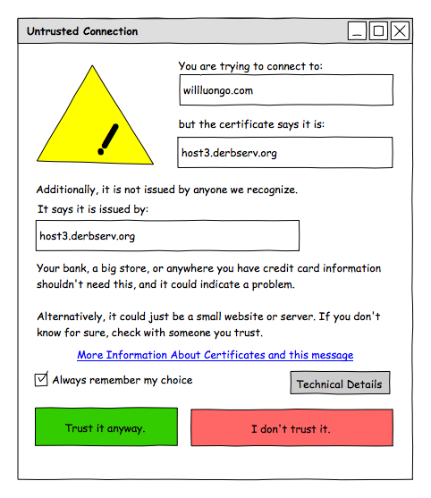
Today I had to help my 12 year old daughter (Ana) interpret the “Thunderbird untrusted certificate” error. It’s very similar to the one you’ll see in pretty much any browser or email client, but what I don’t understand is this: We have all of these smart people (smarter than I am, anyway) working on this, why isn’t the message more meaningful?
After walking Ana through what the message was saying (and what it was trying to say), I thought “Instead of confusing people who don’t know, and irritating people who do, what if we made a meaningful dialog for more users?”
Namely, as a technical person, I just want to see who the certificate belongs to or was issued by. I shouldn’t need to click for more details unless I want to see more details (keys, hashes, etc).
Less technical people shouldn’t have to get in the habit of ignoring the messages that come across their screen, nor should they need to grab a tech person everytime a server changes for their email.
So here is a dialog box that I came up with that I feel more closely meets both of those needs. Why didn’t we implement something like this?
